Background
Ceridian is a global Human Capital Management software company. Their flagship platform Dayforce, provides human resources, payroll, benefits, workforce management, and talent management capabilities in a single solution. Ceridian helps companies of all sizes manage their entire employee lifecycle, from recruiting and onboarding, to paying people and developing their careers.
The ask
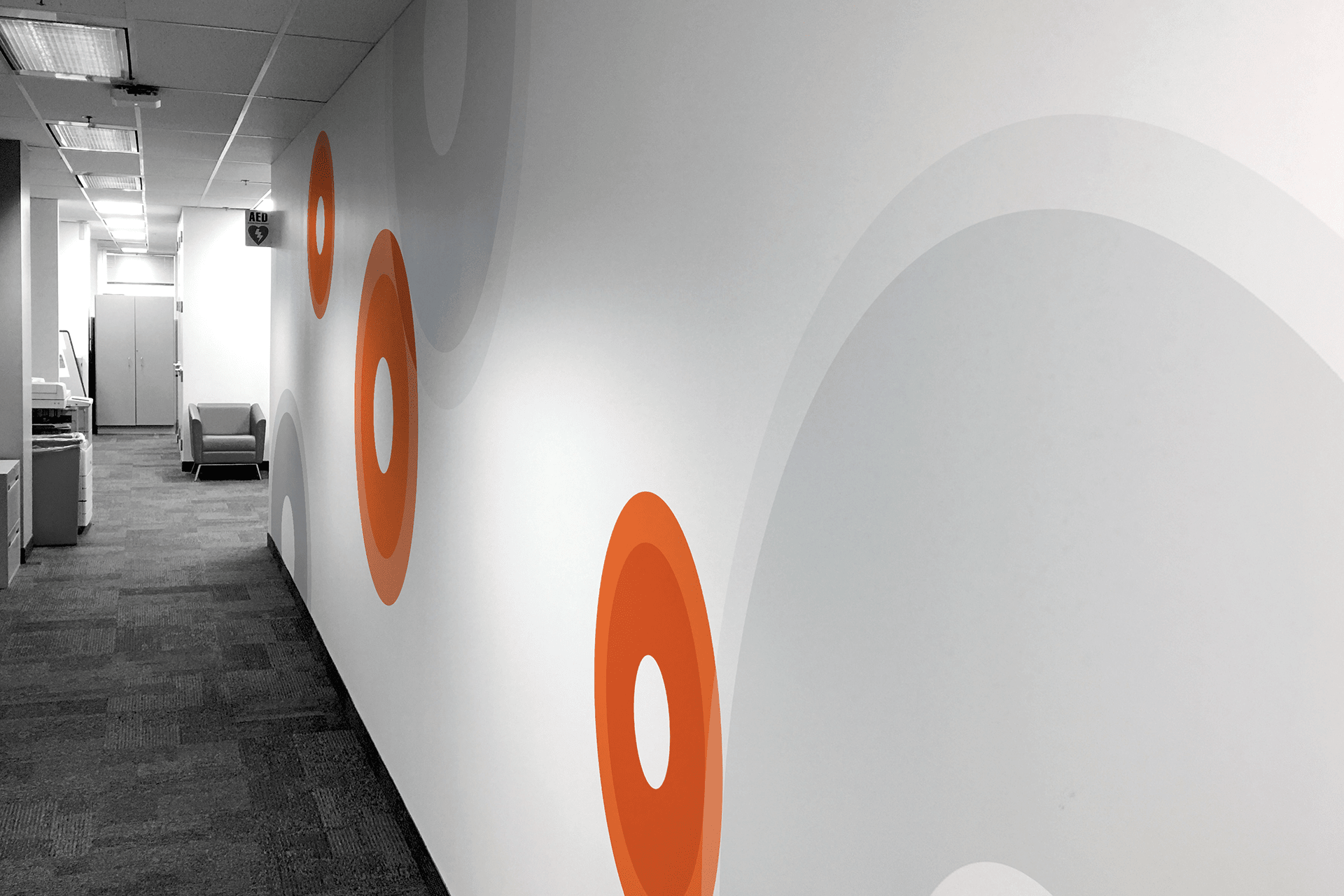
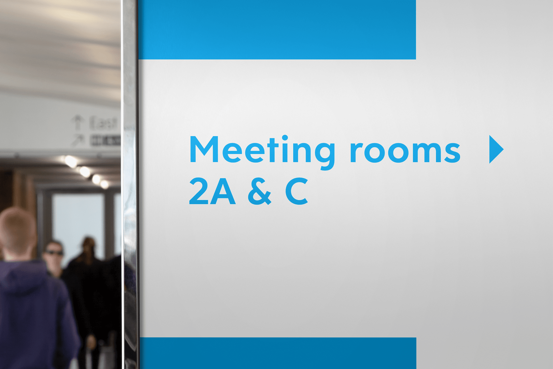
After a relatively recent rebrand, the murals in the Ceridian offices looked out-dated and off-brand. Most of their locations have several floors with a lot of blank wall space, which they wanted to fill with engaging murals to create an inspiring and energetic place to work. Some of their locations wanted to implement their own graphics, but the lead office in Toronto thought it best to push back on those plans until a unified look could be created. I was recruited to design new wall murals and way-finding signage that would work in conjunction with the new brand. They wanted to make sure that the design would be consistent across their 23 office locations worldwide to enforce a cohesive brand message. As much fun as it would have been, it was impractical to travel to every location to design for the space, and so the idea was to create an adaptable and versatile system that could be summarised in a guidelines document so that a local supplier could follow and implement the design.
The approach
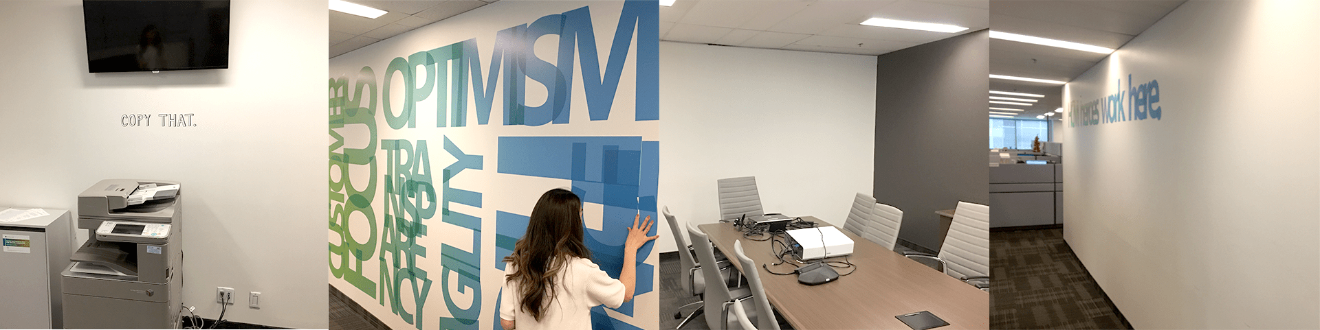
After a jump-off call, I conducted a site visit of two Toronto offices, and was walked through the new brand guidelines as well as some initial concepts the in-house team had designed. Whilst exploring the offices, I noticed that some wall murals were tailored to a particular area — 'Copy that' in the copy room for example. I liked the idea, and thought it could be a good way to ensure the new murals weren't too generic or repetitive. The offices were vast, with a lot of empty wall space, and I understood why they needed something to breathe some life into them.
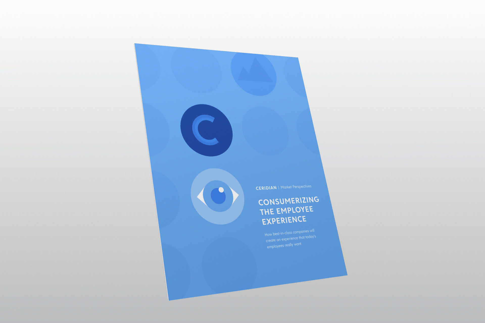
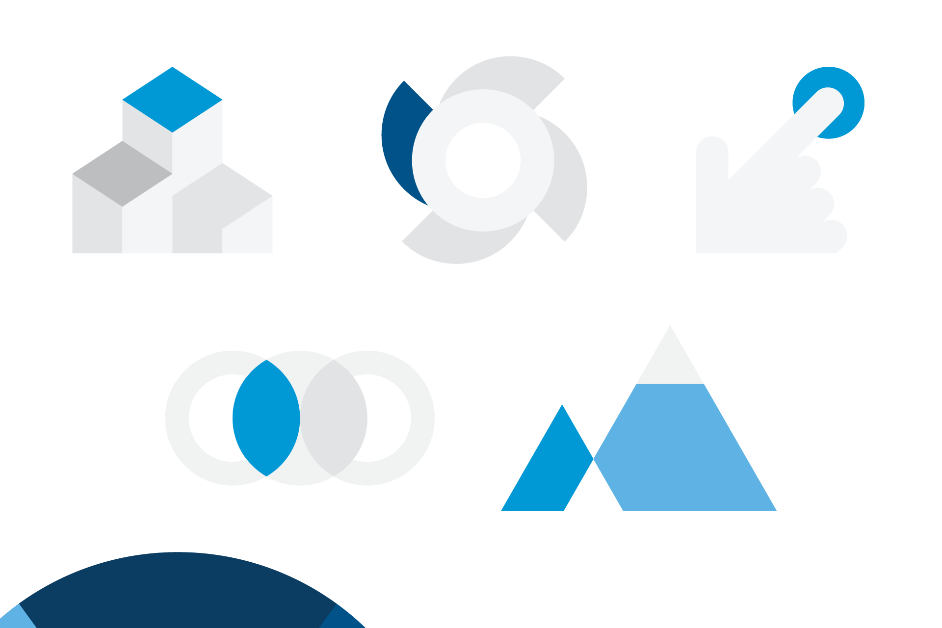
I was presented with some ebooks that were recently made. The graphics used within them met with the approval of the board as well as the target audience, and were liked far more than other secondary elements created with the new brand. I dissected the icons and thought how I could expand upon the idea, perhaps mimicking the style to allow for more options, as well as the potential for custom designs for each office.
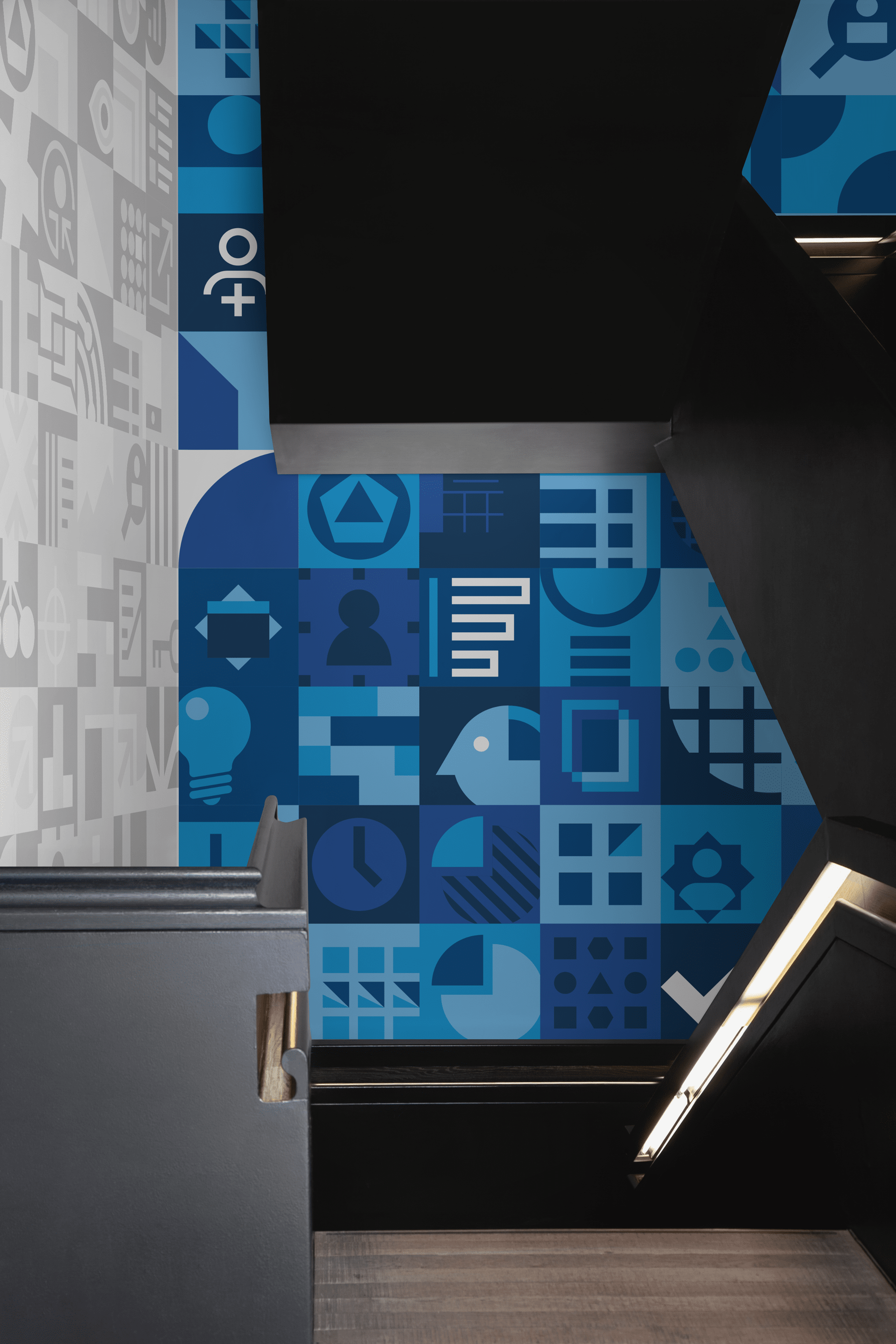
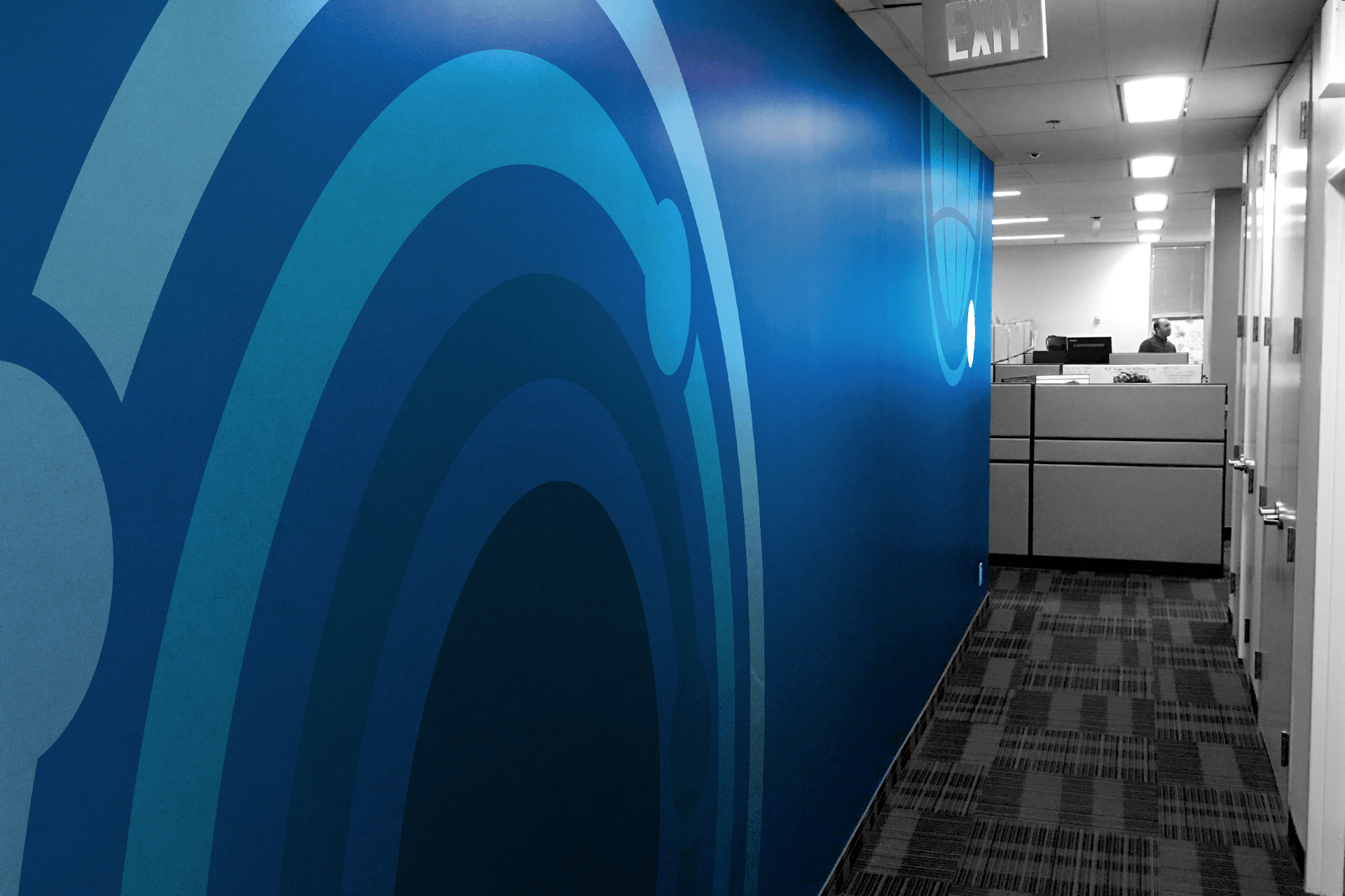
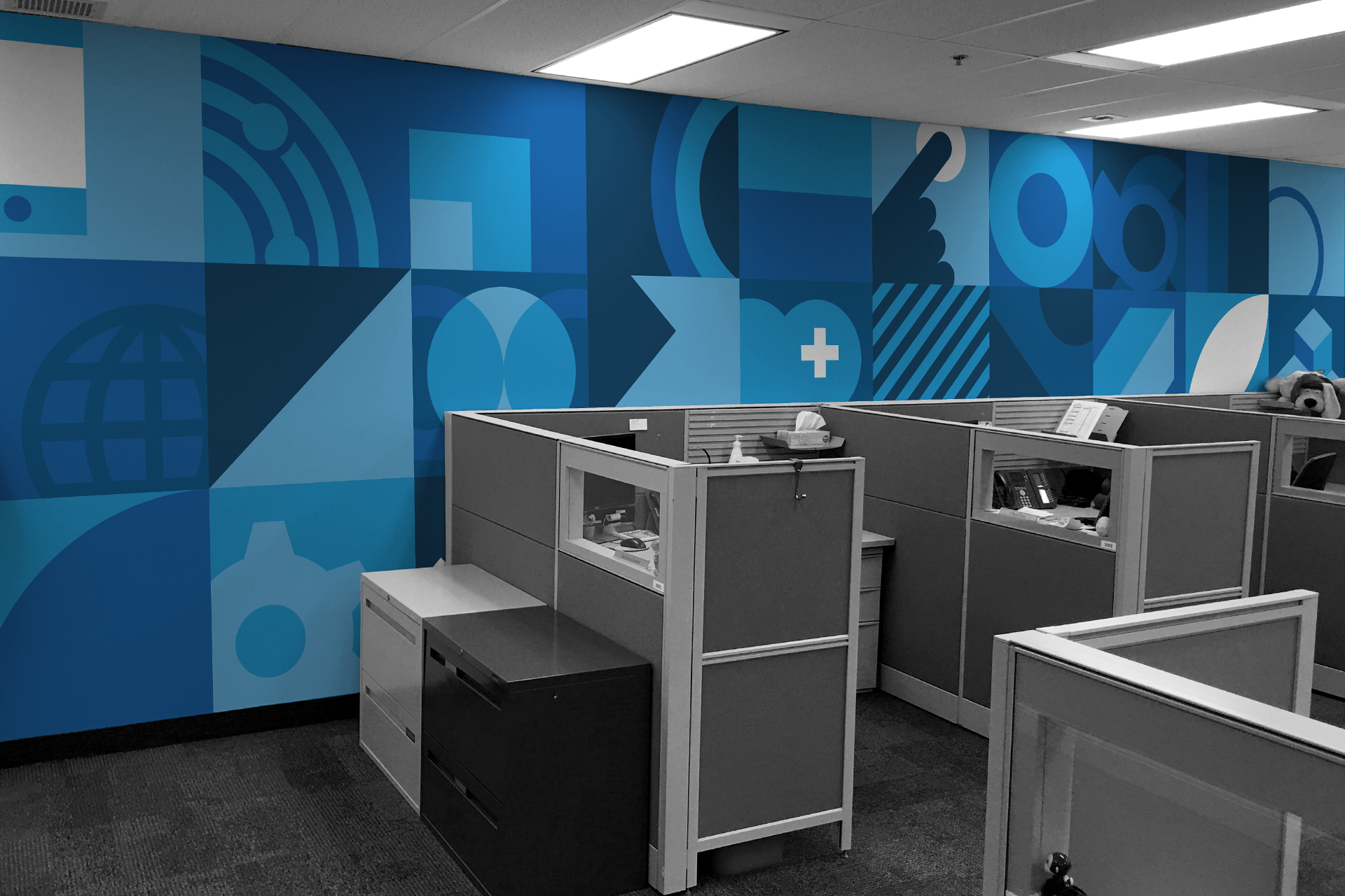
Corridor walls
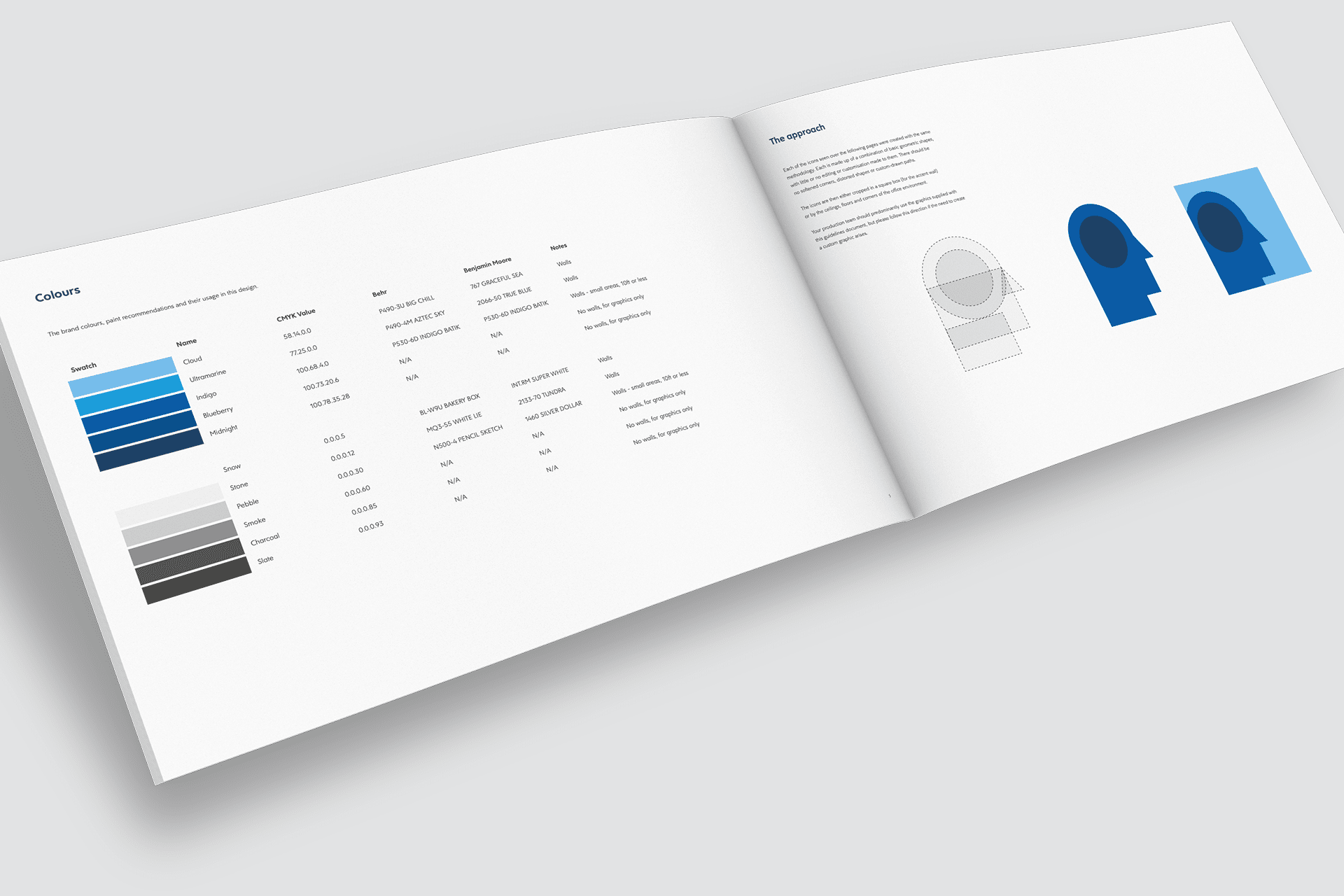
The software that Ceridian creates offers a multitude of services to the user, covering every possible need within the Human Capital Management sector. I thought it would be interesting to generate as many different icons as I could, symbolising their vast offering. Using these enlarged icons, I created designs for the office corridors. By allowing the icons to run off the walls, I wanted to hint at a bigger picture, that the viewer is only seeing a small amount of what Ceridian can offer. I was able to add further variety by using the secondary colour palette.
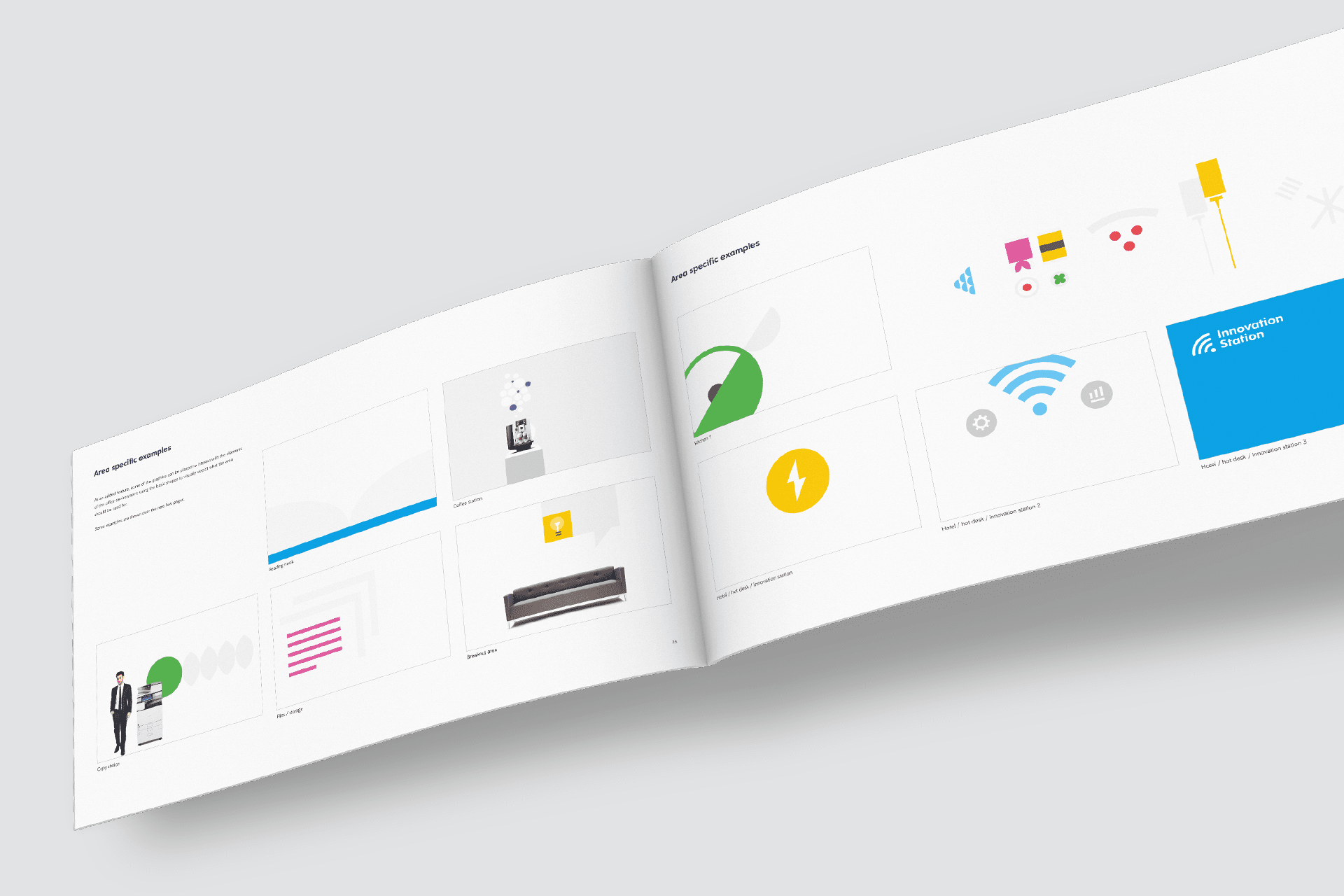
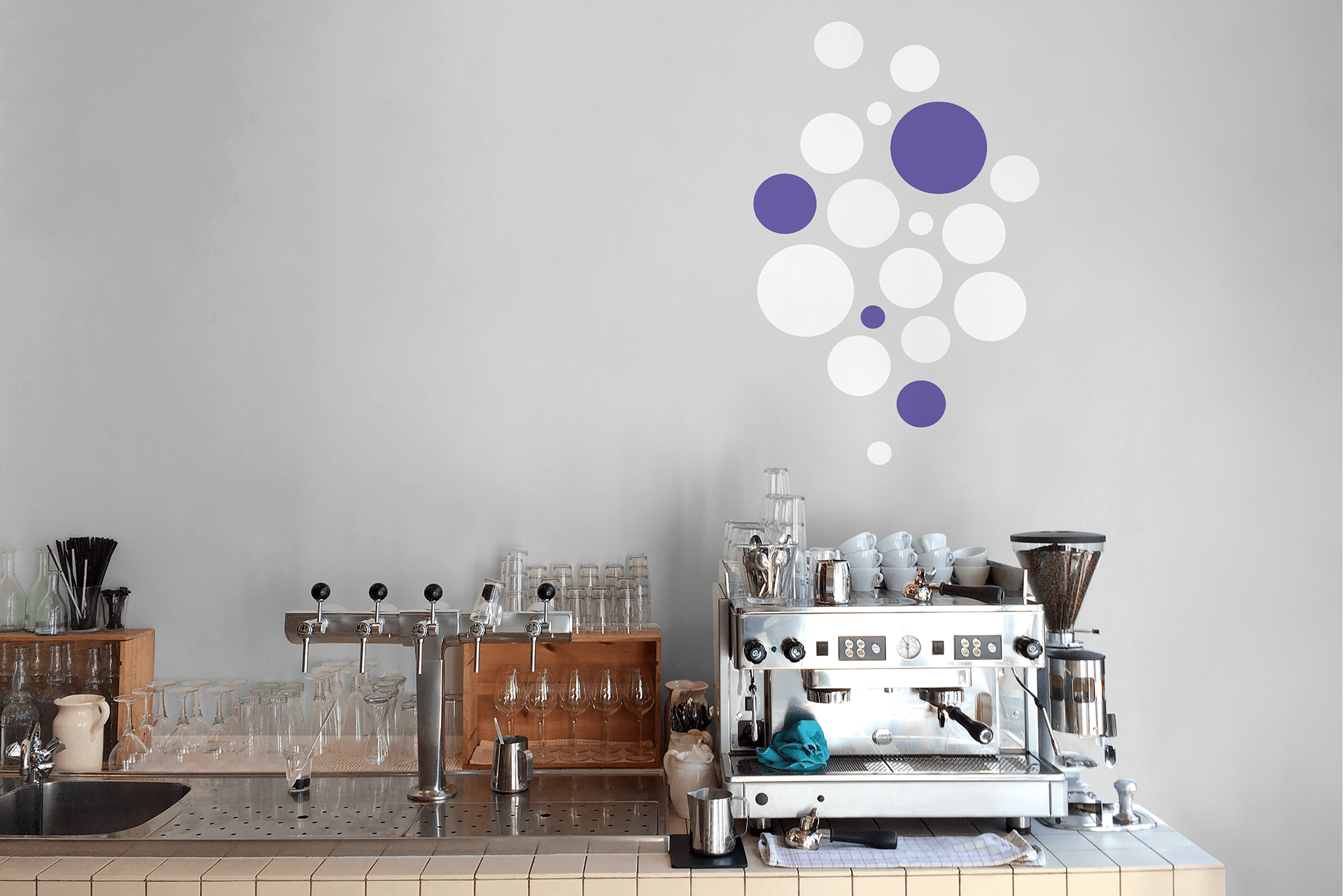
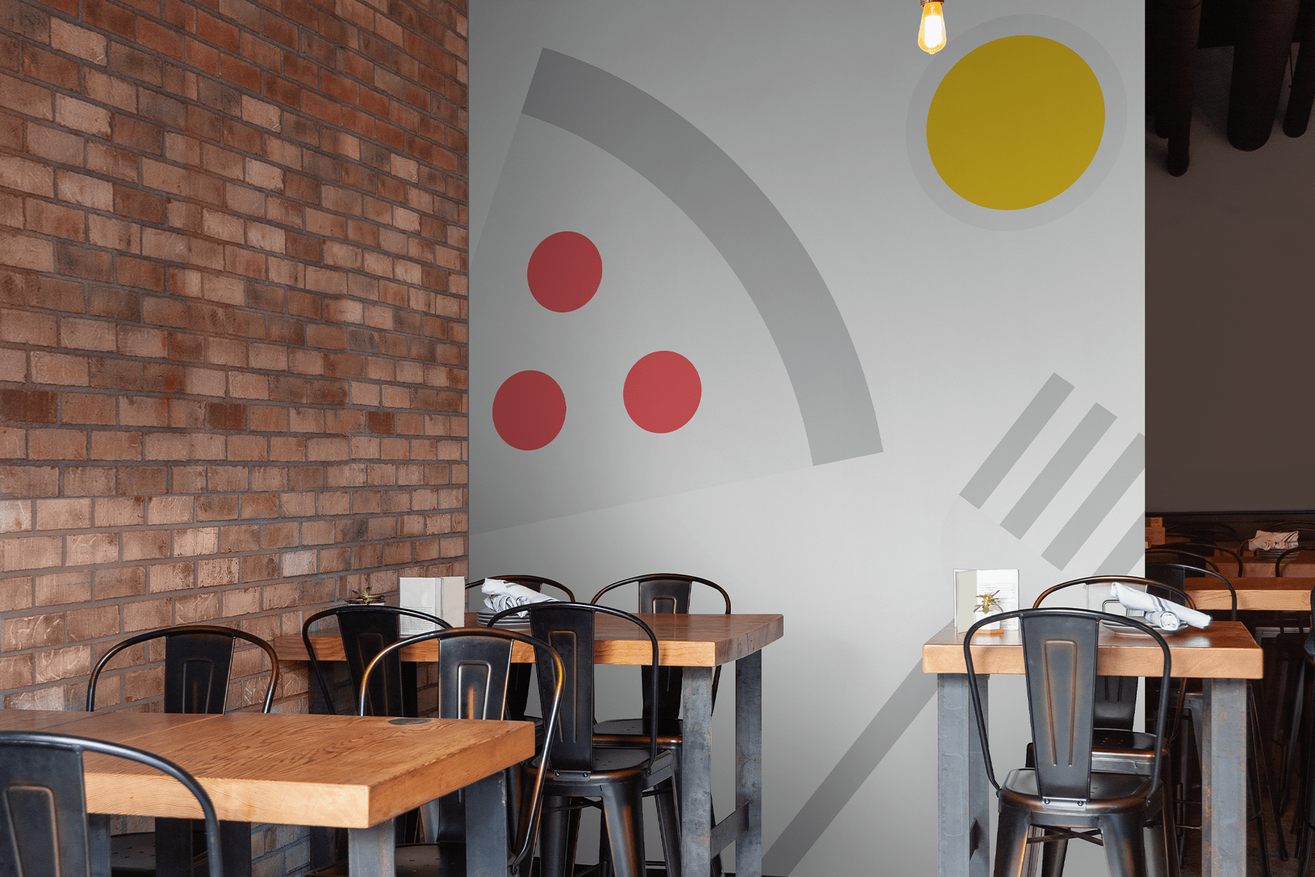
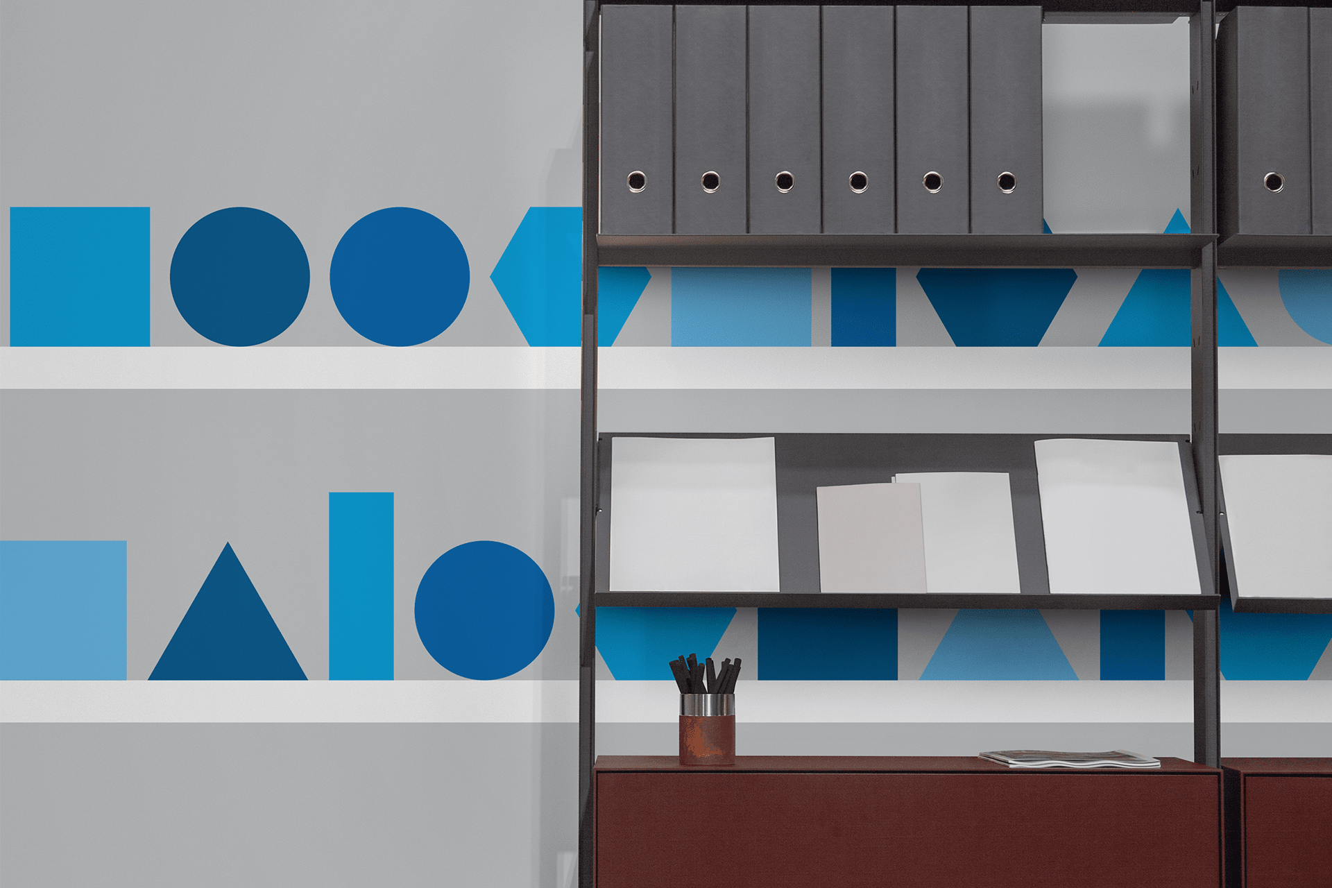
Area-specific walls
Keeping with the icon theme, but moving away from Ceridian's service offering a bit, I created icons specific to certain areas.

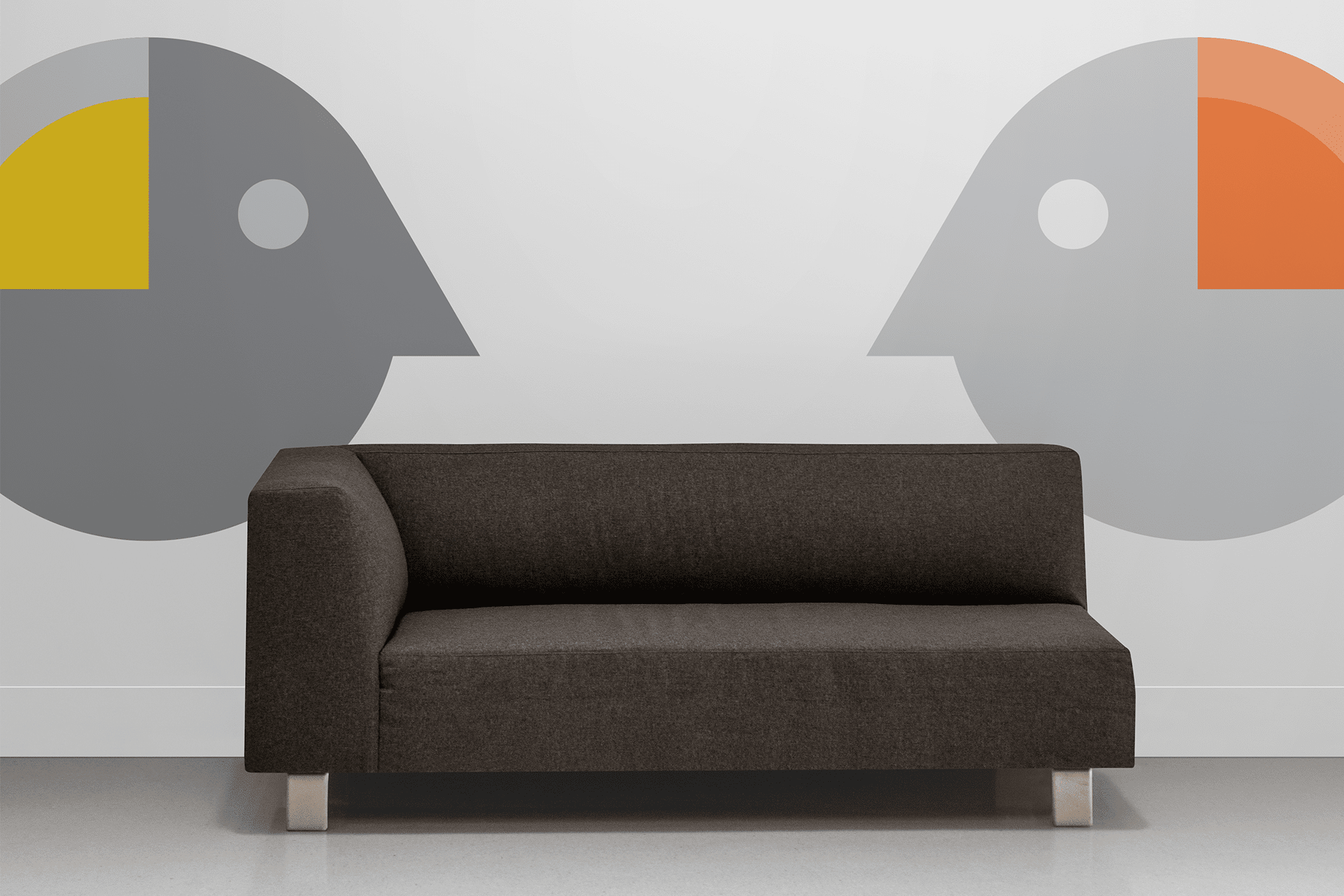
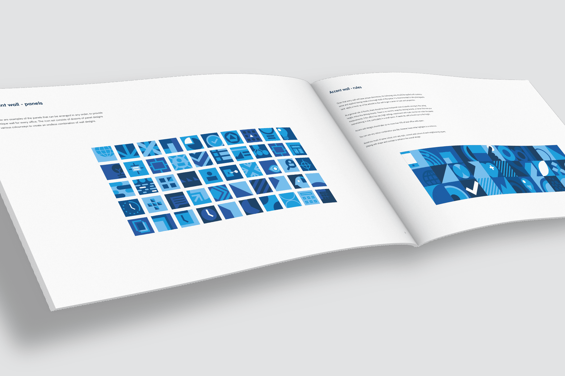
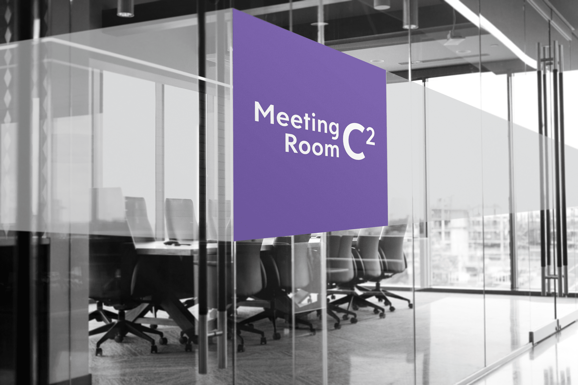
The accent wall
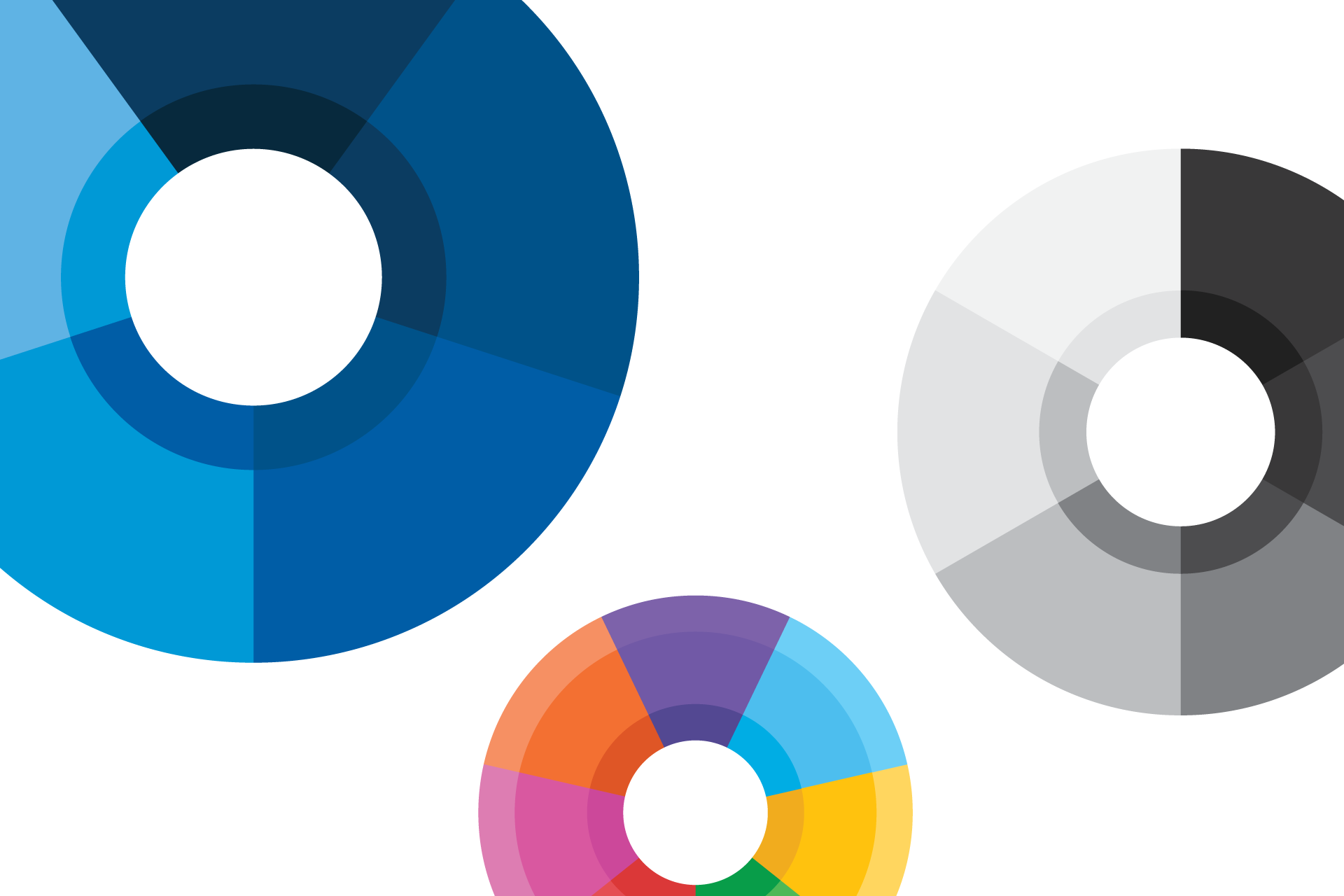
There were a few key areas where the client wanted something really striking to take over the space. I thought about taking the icon idea and cropping into boxes - continuing the theme that there's so much more than meets the eye with Ceridian. With all of the different icons, colours and placement combinations, there are infinities possibilities for these accent walls. I provided artwork for 640 panels with instructions on how to draw more outlined in the guidelines.


The final deliverable
I compiled all of the designs, as well as an abridged brand guidelines and instructions into a single document, that could be sent out to each of Ceridian's Worldwide offices. In order to ensure the artwork was replicated accurately each time, the instructions had to be simple and ironclad to avoid any misinterpretation.